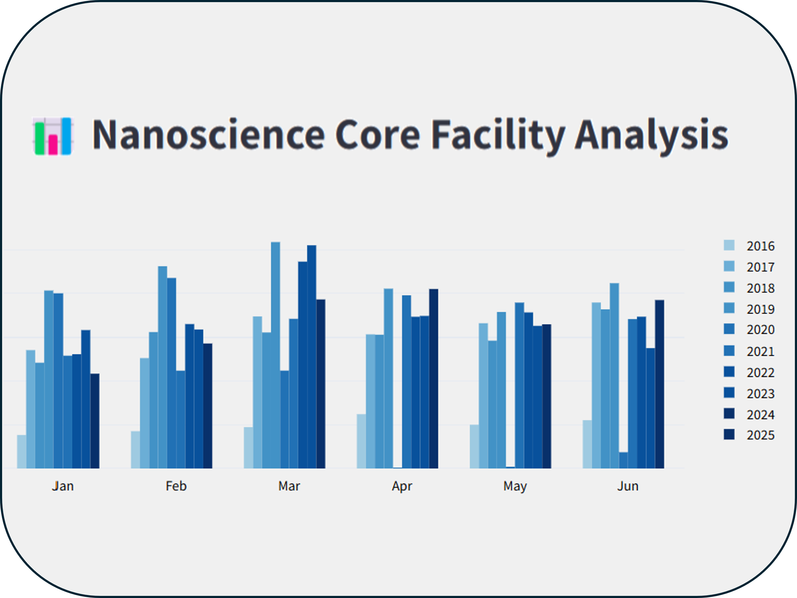
Facility Usage Dashboard
Dashboard | Visualization • Shared User Facility
Challenge
The challenge was to create a dashboard to easily visualize the lab usage. The data was embedded in a Badger Lab Management System, and was formatted in XML. The data needed to be cleaned and formatted and a pipeline needed to be created to update the dashboard on a monthly basis.
The Approach
We were able to locate an API call that gave a url link to the XML data. This data was then scraped using the request library and formatted into a Pandas dataframe. A dashboard was built in streamlit and the application was deployed to Render.
Results
This dashboard provides the basis for lab usage data in one of the 5 core facilities in the CUNY ASRC. This has been widly used when evaluating the usage metrics for the different labs and PIs. Additionally it has been instrumental when writing grant proposals where the utility of the core facilities needs to be justified.
Future Plans
We are now in the process of creating a master database of all of the core facilities in the CUNY ASRC. This will allow for a much more comprehensive dashboard to be created. This new application is being built out with the Django framework, with the hopes that it will be able to be integrated with NEMO lab management open source software in the future.